🇧🇷
O principal desafio na criação da marca Lara Alves Arquitetura foi encontrar o equilíbrio perfeito entre racionalidade técnica e sensibilidade humana, características fundamentais do trabalho da arquiteta.
Era necessário desenvolver uma identidade que transmitisse simultaneamente conhecimento metodológico e acolhimento, sem cair em clichês comuns do setor de arquitetura. A marca precisava se destacar em um mercado competitivo de Umuarama, diferenciando-se dos escritórios estabelecidos, mas mantendo a sofisticação necessária para atingir o público de médio e alto padrão.
Outro desafio significativo foi criar uma identidade que funcionasse tanto para o momento atual, onde Lara atua principalmente com interiores e em parceria com outros profissionais, quanto para seu futuro crescimento, permitindo uma eventual expansão para um escritório maior.
🇺🇸
The main challenge in creating the Lara Alves Arquitetura brand was finding the perfect balance between technical rationality and human sensitivity, fundamental characteristics of the architect's work.It was necessary to develop an identity that simultaneously conveyed methodological knowledge and hospitality, without falling into common clichés in the architecture sector.
The brand needed to stand out in a competitive market in Umuarama, differentiating itself from established offices, but maintaining the sophistication necessary to reach the medium and high-end public.
Another significant challenge was creating an identity that would work both for the current moment, where Lara works mainly with interiors and in partnership with other professionals, and for her future growth, allowing for an eventual expansion to a larger office.
Direction&Design - Estúdio Junior Russo
Service: Branding & Visual Identity
Client: Lara Alves Arquitetura


🇧🇷
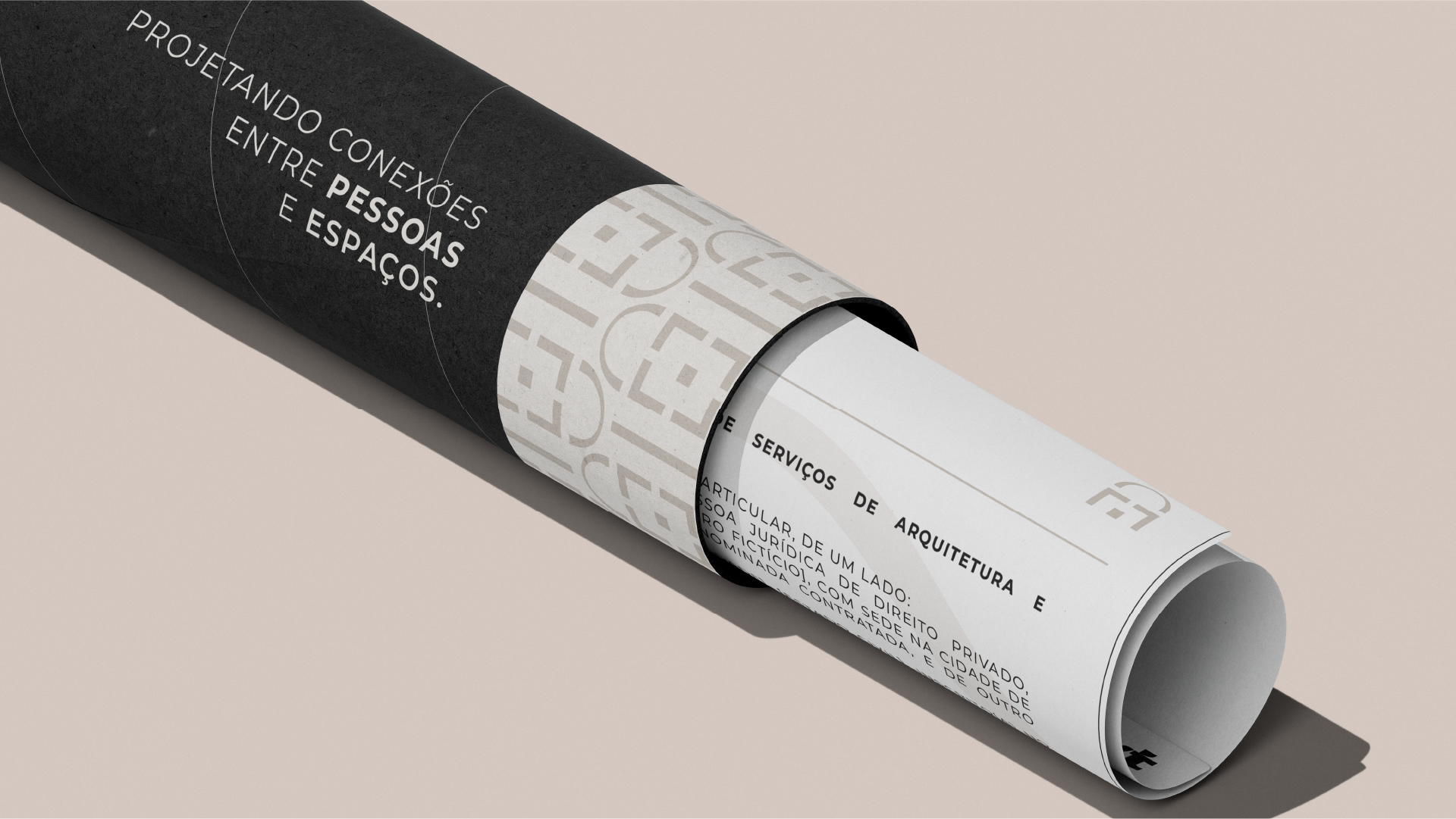
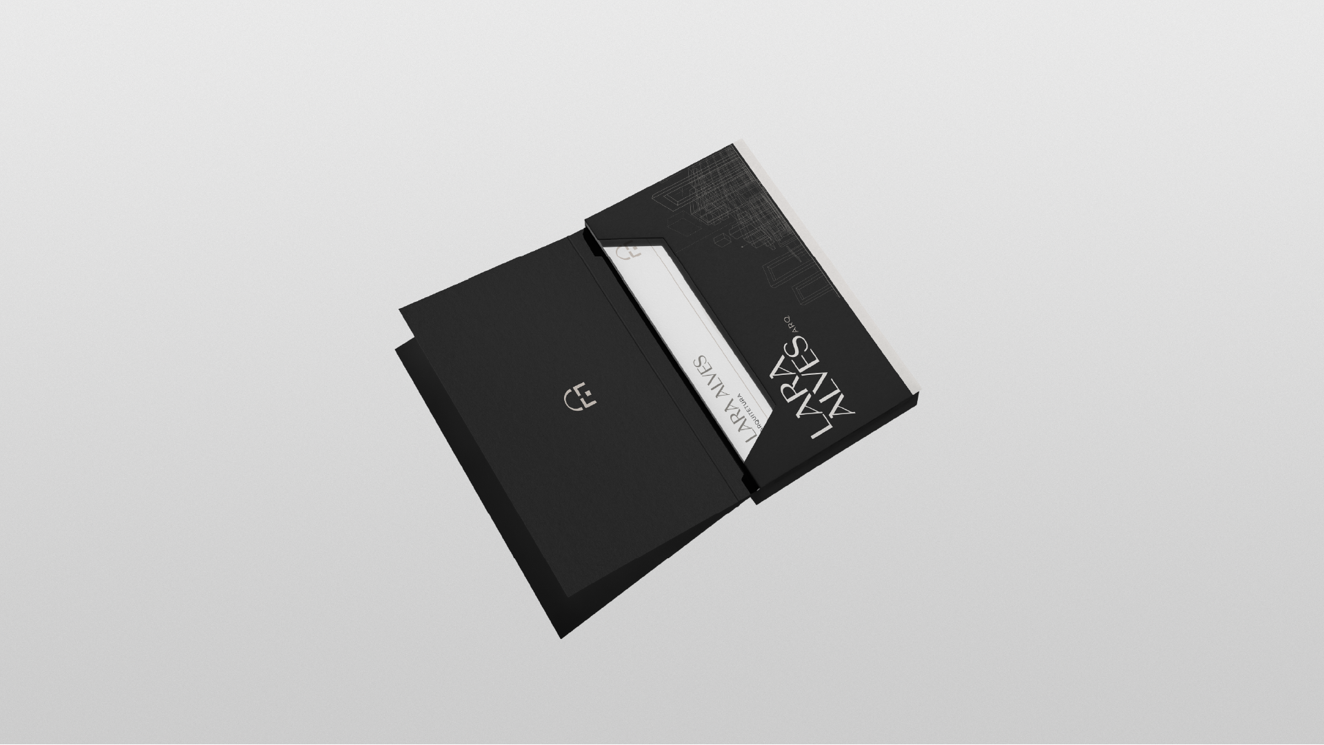
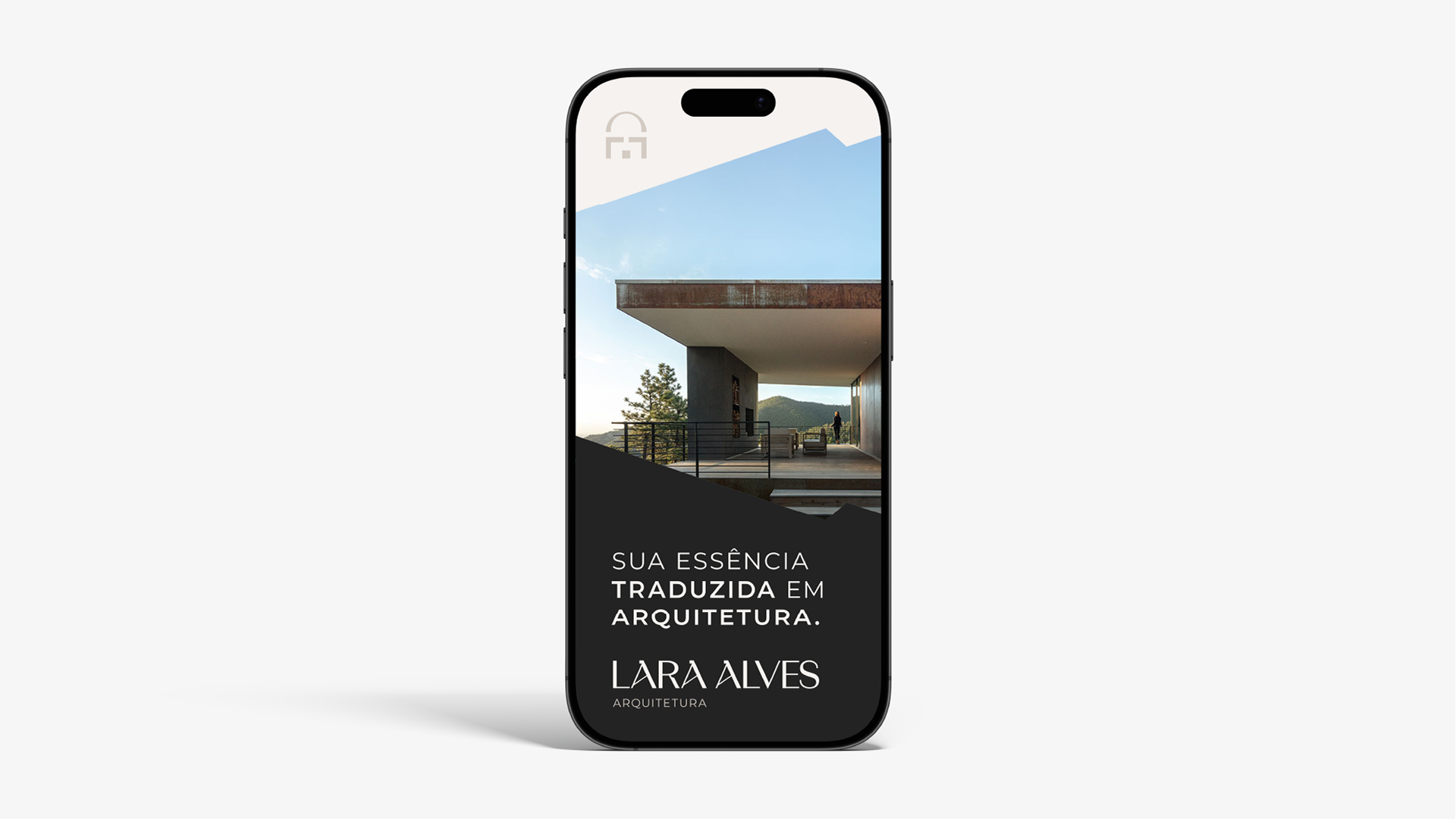
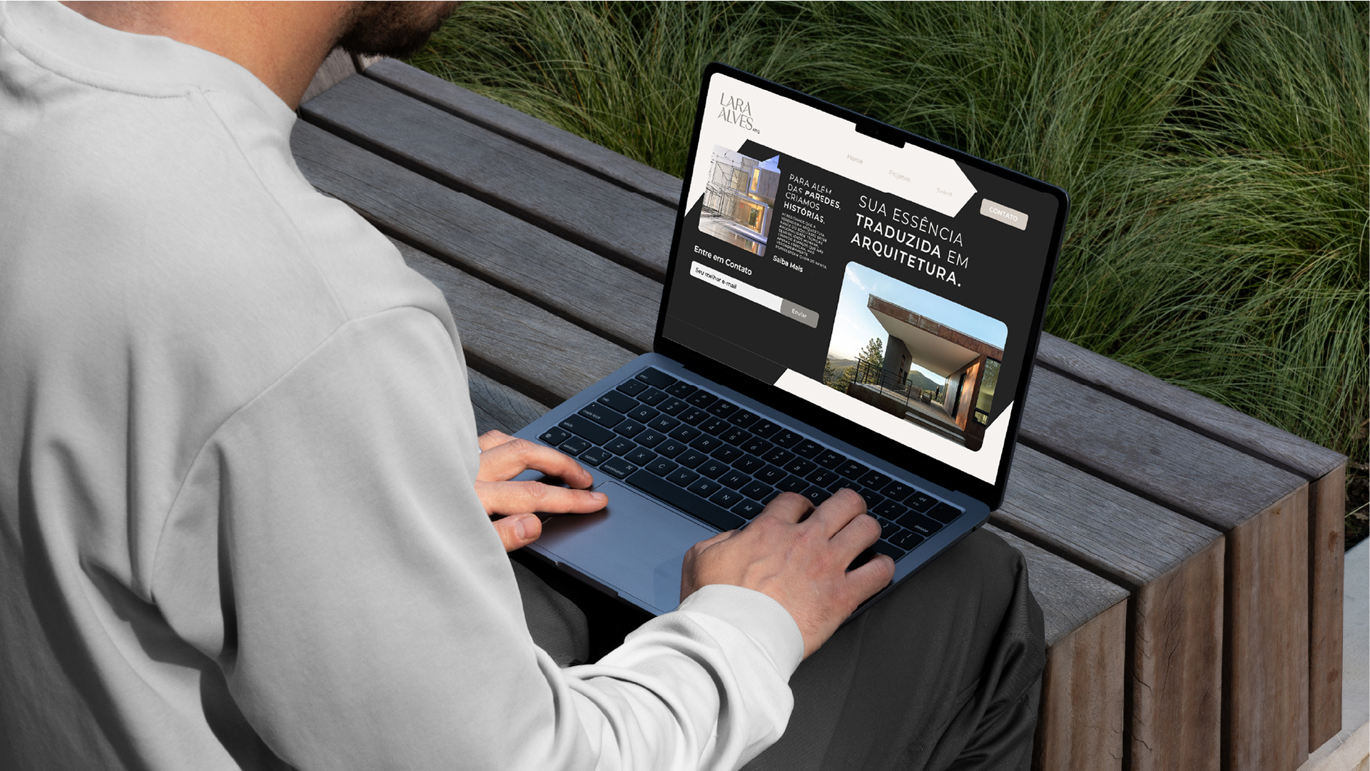
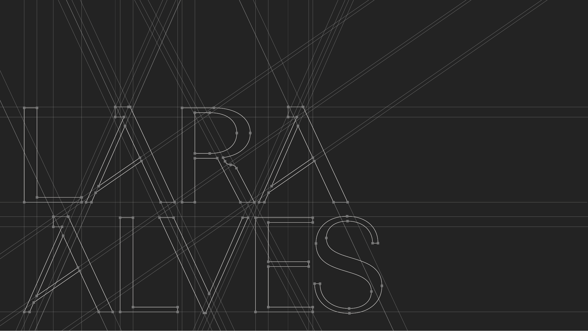
O resultado foi uma identidade que traduz com precisão a essência do trabalho de Lara Alves, fundamentada em uma paleta sóbria e elegante com tons de preto premium, cinza quente, bege sofisticado e off-white. A tipografia escolhida equilibra minimalismo com personalidade, trazendo modernidade sem perder a estrutura necessária para transmitir credibilidade.
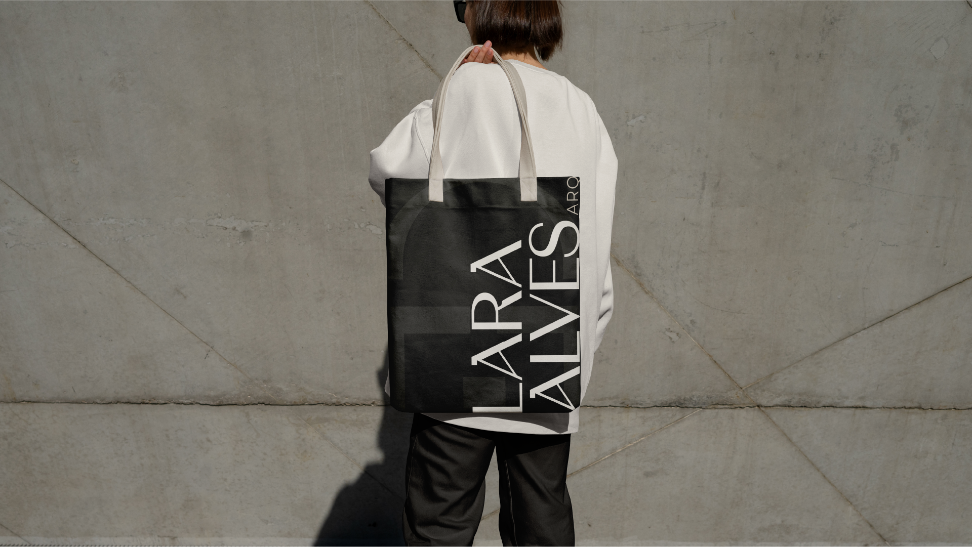
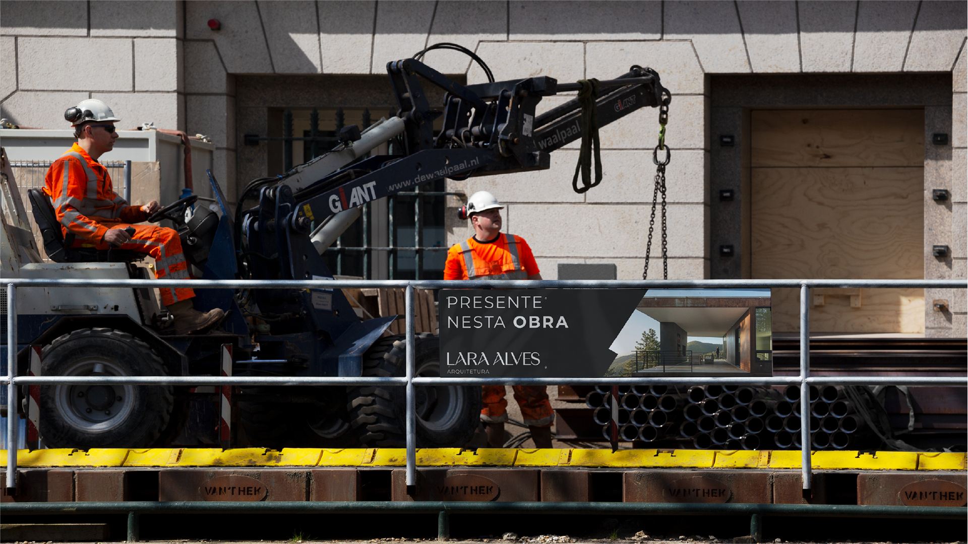
A simbologia desenvolvida a partir do próprio nome cria uma conexão memorável e versátil, permitindo aplicações variadas sem perder a essência. A marca consegue comunicar tanto a metodologia própria quanto a abordagem humanizada do escritório, criando uma identidade que funciona perfeitamente nos diversos pontos de contato, desde o Instagram até as placas de obra, refletindo o posicionamento premium do escritório sem parecer inacessível.
🇺🇸
The result was an identity that accurately reflects the essence of Lara Alves' work, based on a sober and elegant palette with tones of premium black, warm gray, sophisticated beige and off-white. The chosen typography balances minimalism with personality, bringing modernity without losing the structure necessary to convey credibility.
The symbolism developed from the name itself creates a memorable and versatile connection, allowing for varied applications without losing the essence. The brand manages to communicate both its own methodology and the office's humanized approach, creating an identity that works perfectly across different points of contact, from Instagram to construction signs, reflecting the office's premium positioning without appearing inaccessible.