Brasil - 2023
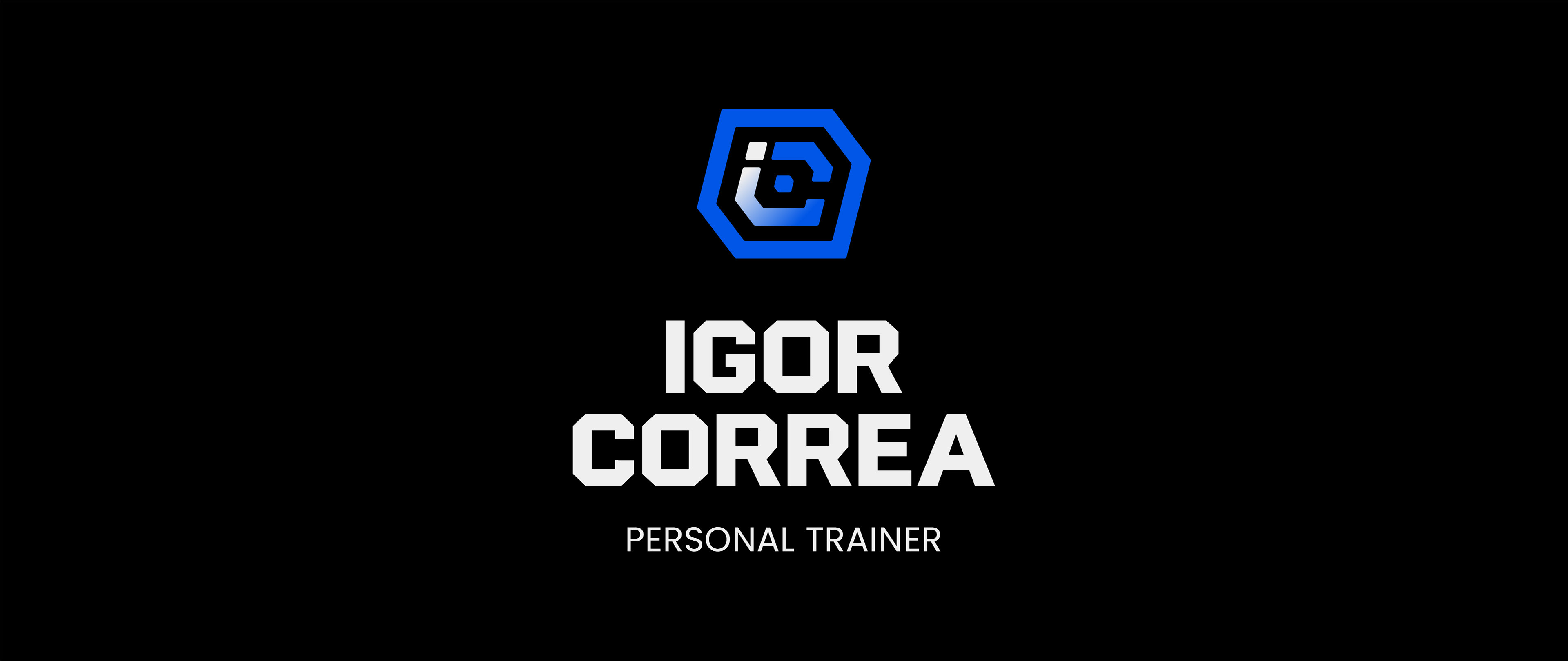
Igor Correa - Personal Trainer
PT-BR
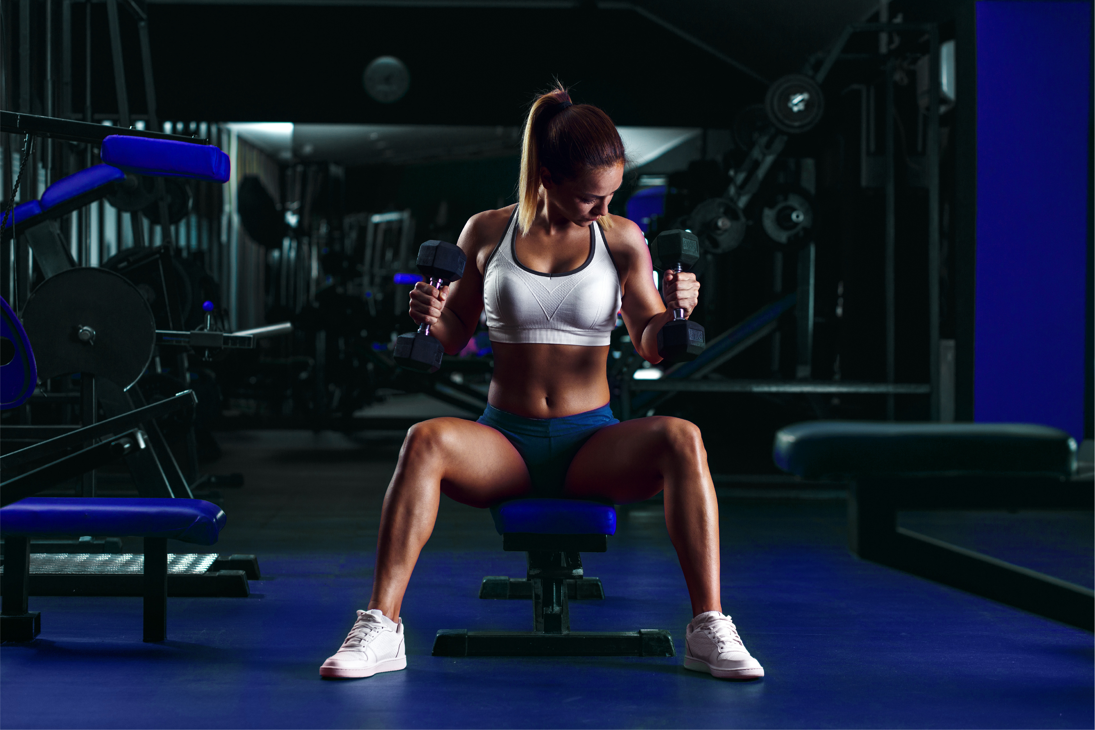
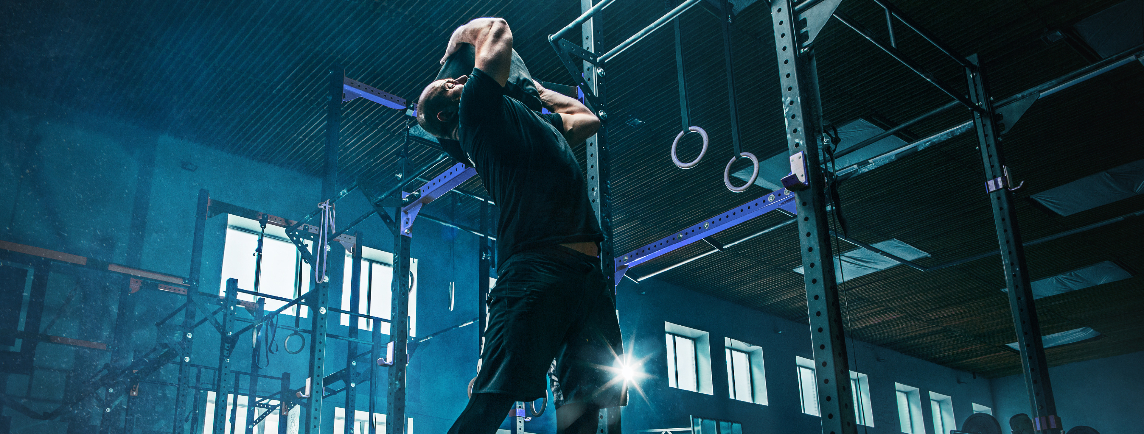
Igor Correa é um profissional de educação física que acredita que cada pessoa é única e deve ser tratada de forma personalizada. Ele entende que os objetivos são diferentes e que cada indivíduo tem sua própria jornada. Sua missão é ajudar seus alunos a alcançarem seus objetivos de forma saudável, equilibrada e com muito foco e dedicação. Para Igor, a prática de exercícios físicos vai muito além de uma questão estética, é um estilo de vida que melhora a saúde física e mental das pessoas. Ele está comprometido em guiar seus alunos rumo a uma vida mais saudável e feliz.
EN-EU
Igor Correa is a physical education professional who believes that each person is unique and should be treated in a personalized way. He understands that goals are different and that each individual has their own journey. Its mission is to help its students achieve their goals in a healthy, balanced way and with a lot of focus and dedication. For Igor, the practice of physical exercises goes far beyond an aesthetic issue, it is a lifestyle that improves people's physical and mental health. He is committed to guiding his students towards healthier, happier lives.
Junior Russo Design
Direção de criação: Junior Russo
Design: Junior Russo
Ano: 2023
Estratégia e expressão
Resultado
PT-BR
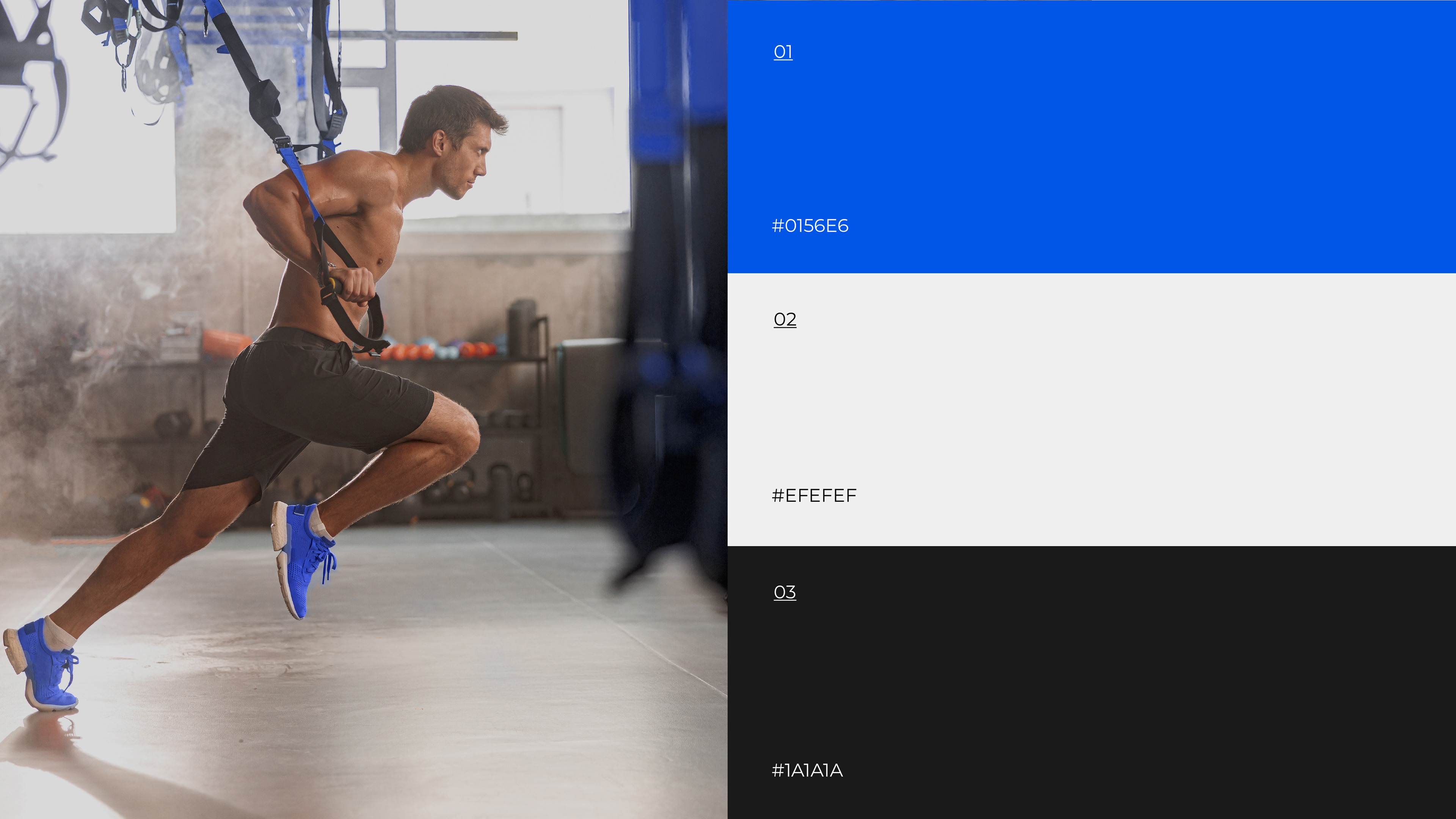
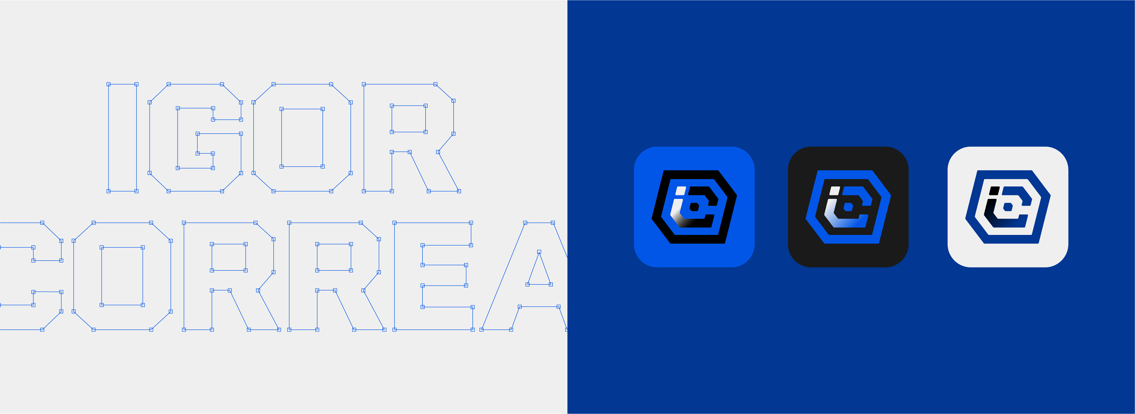
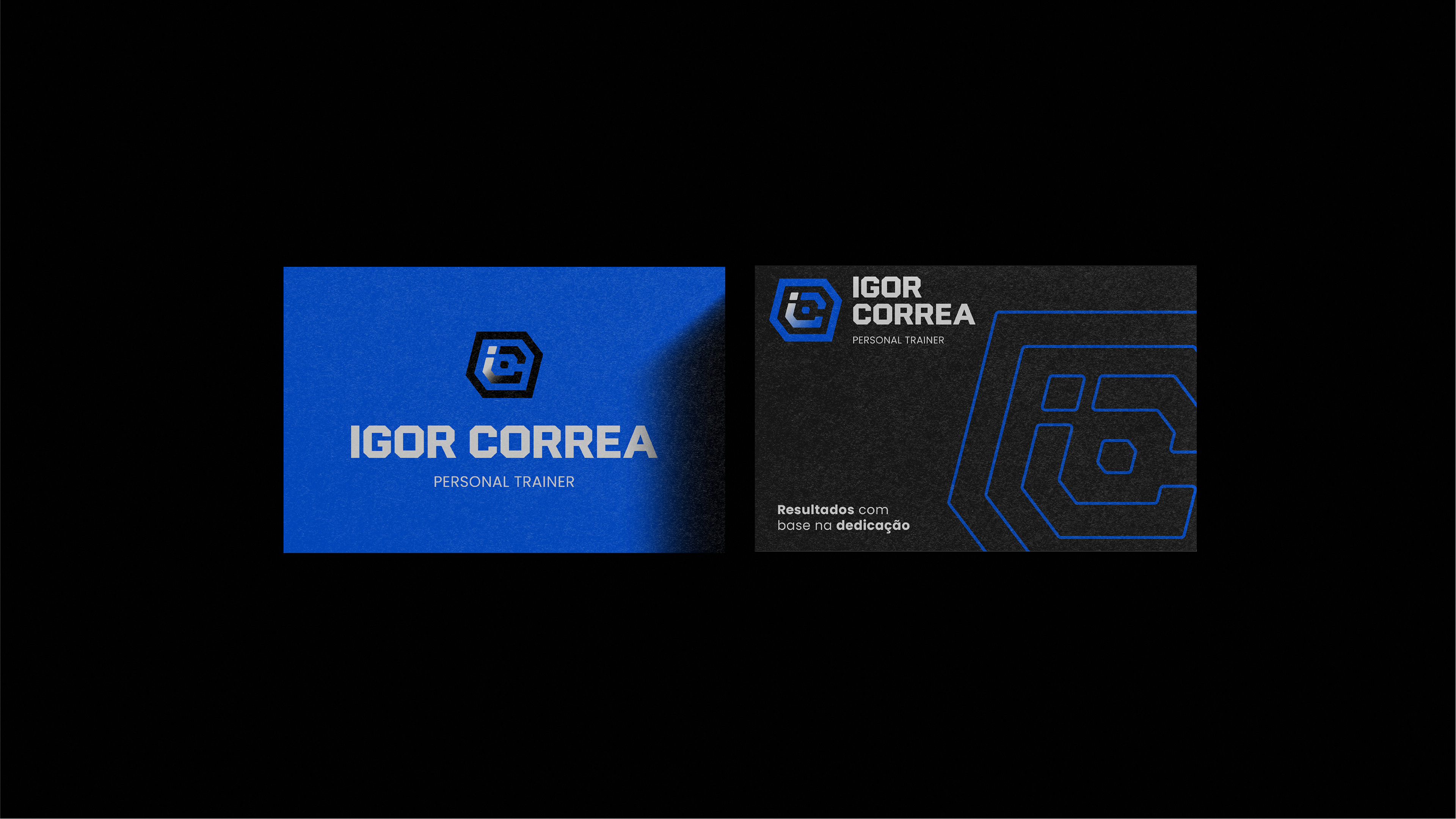
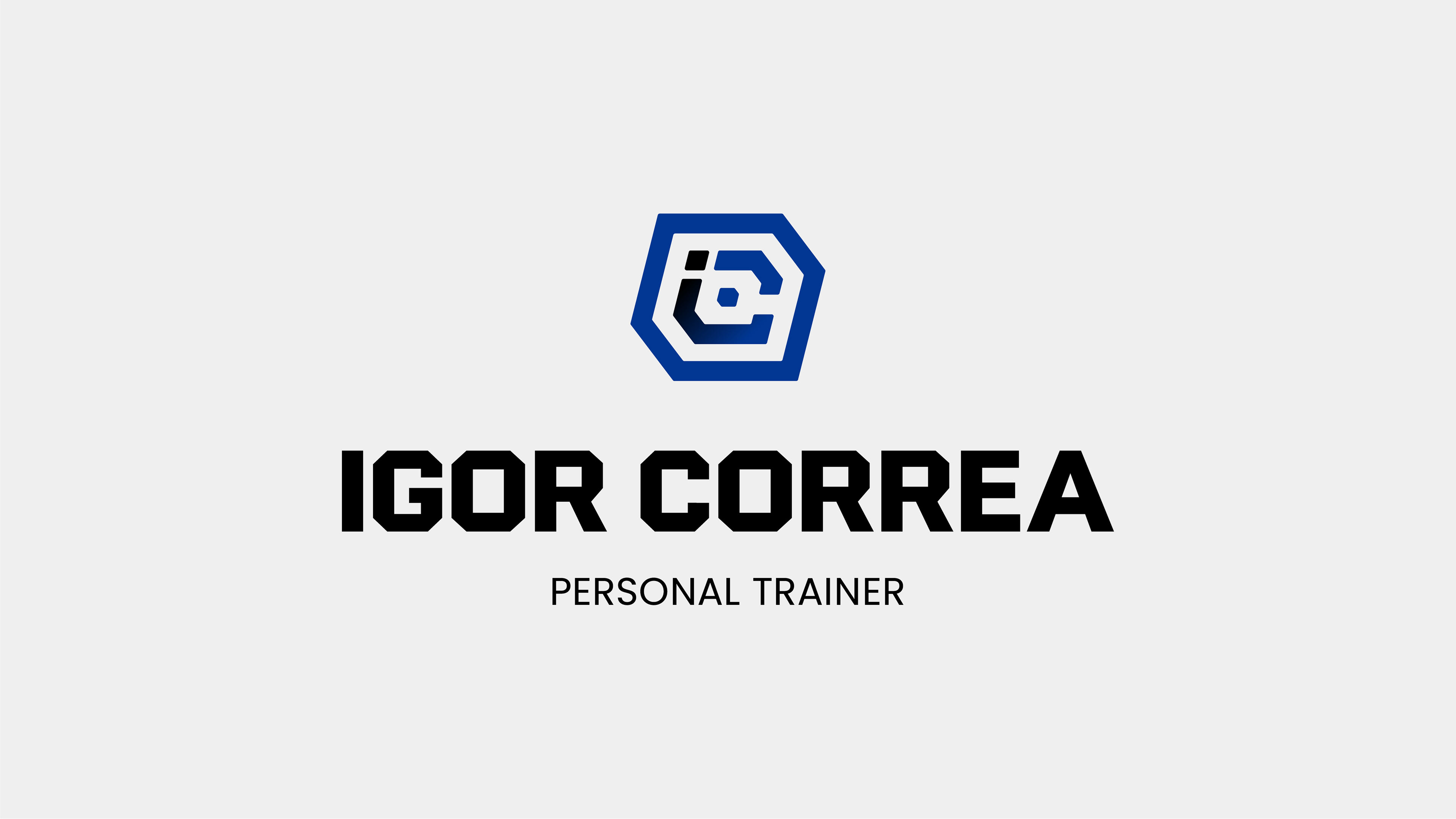
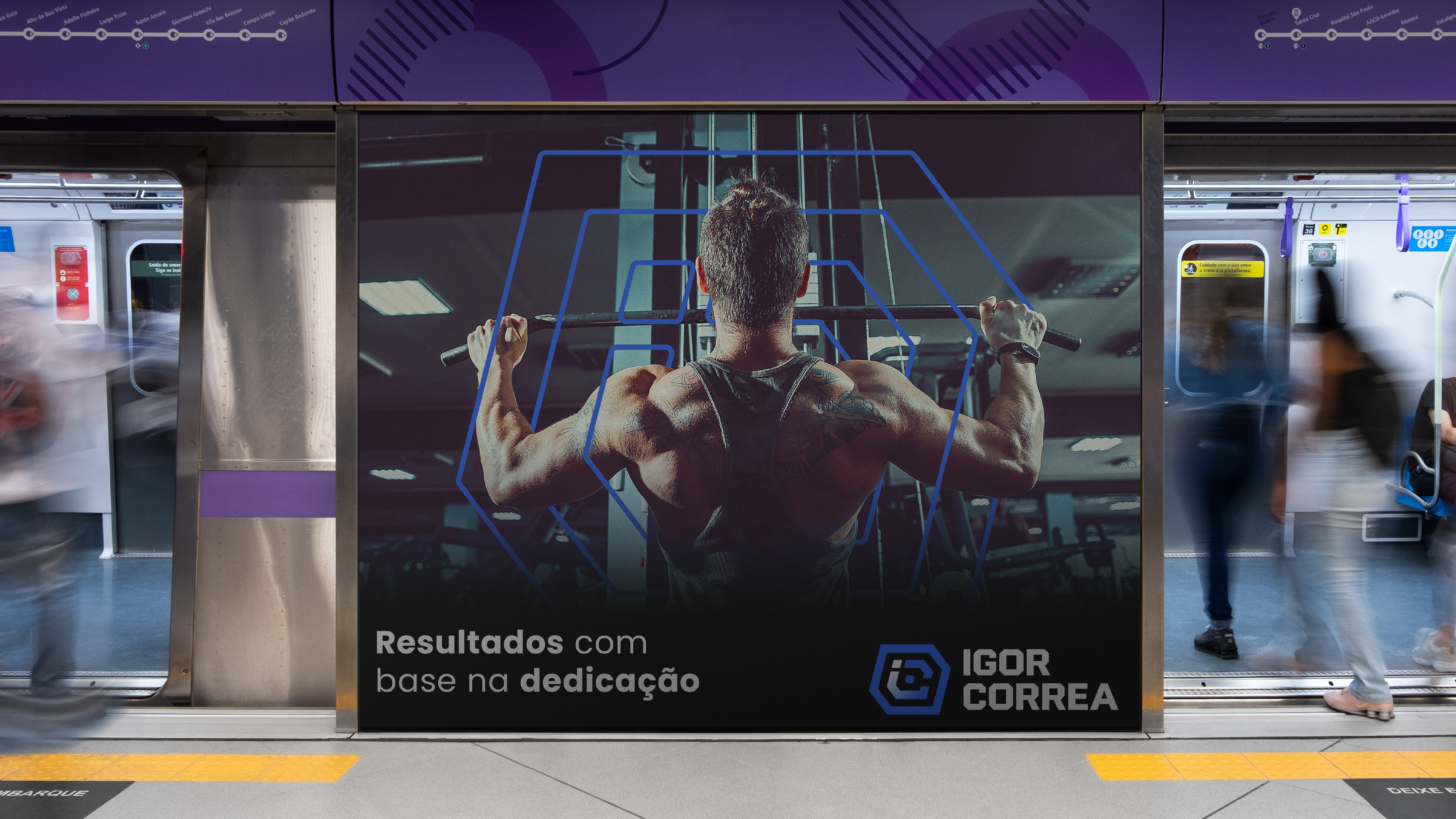
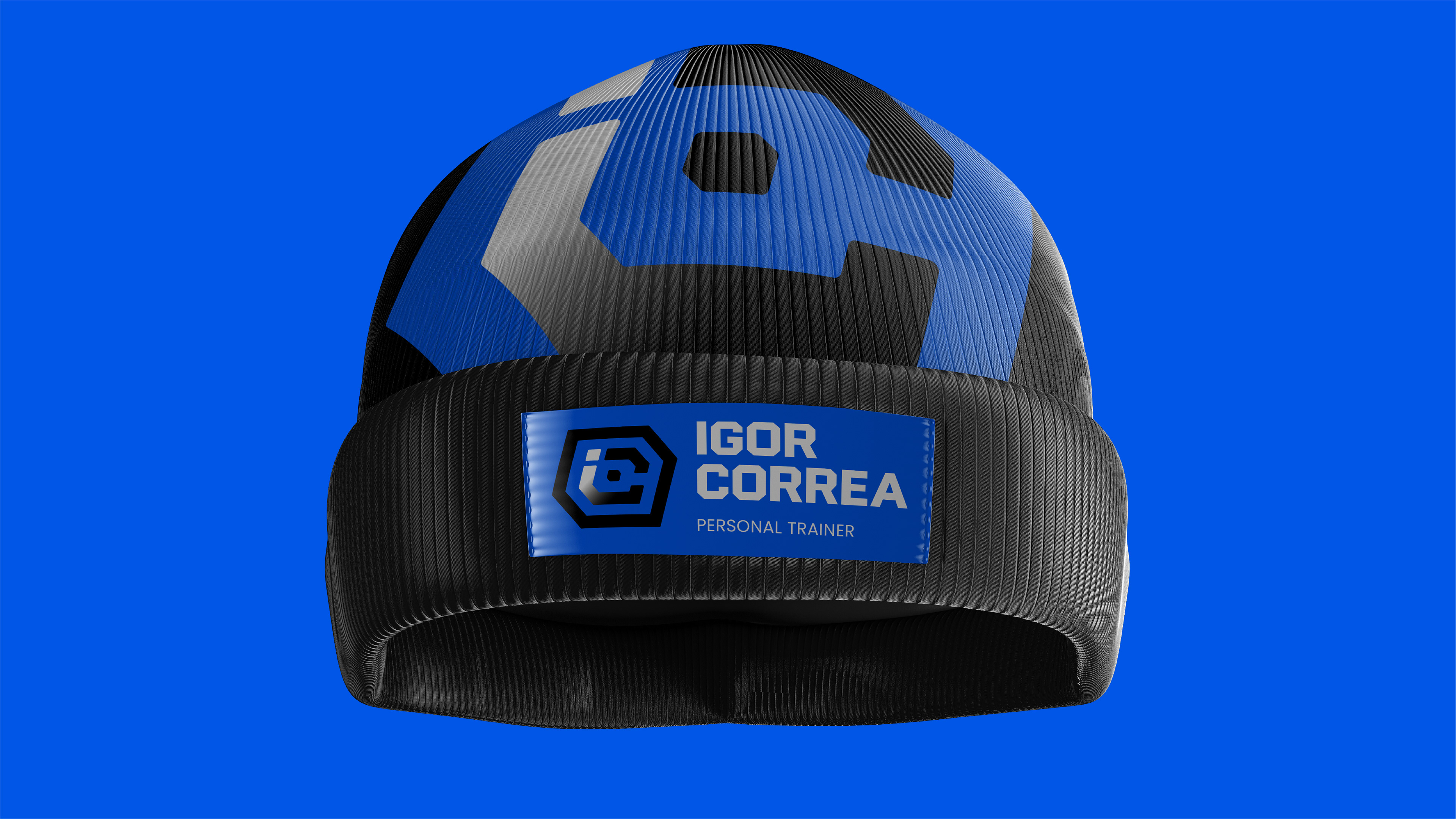
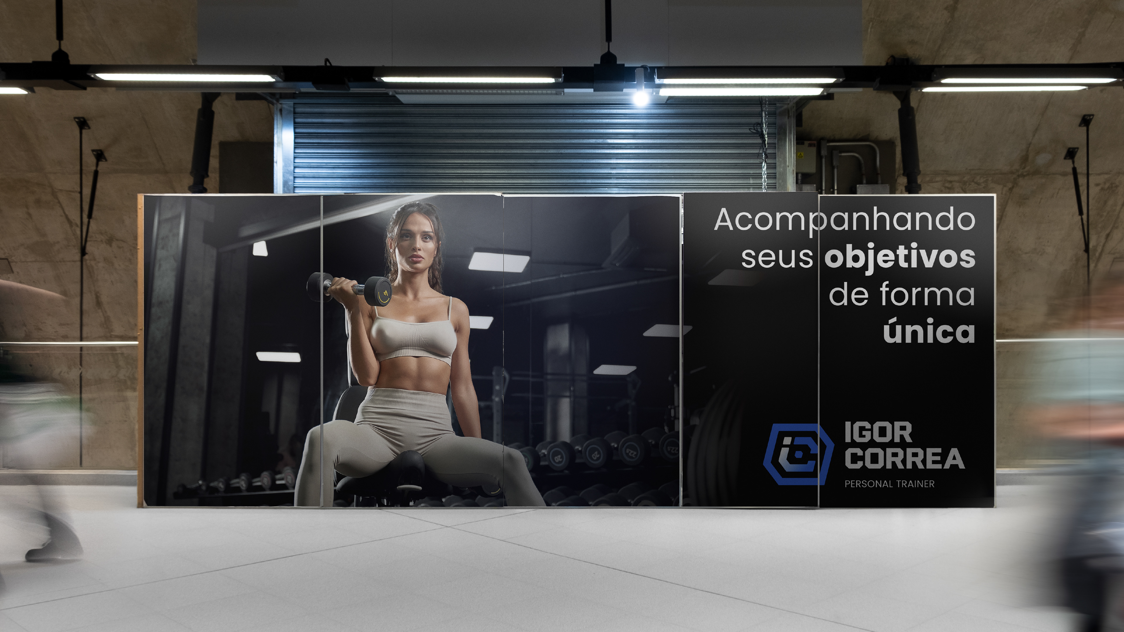
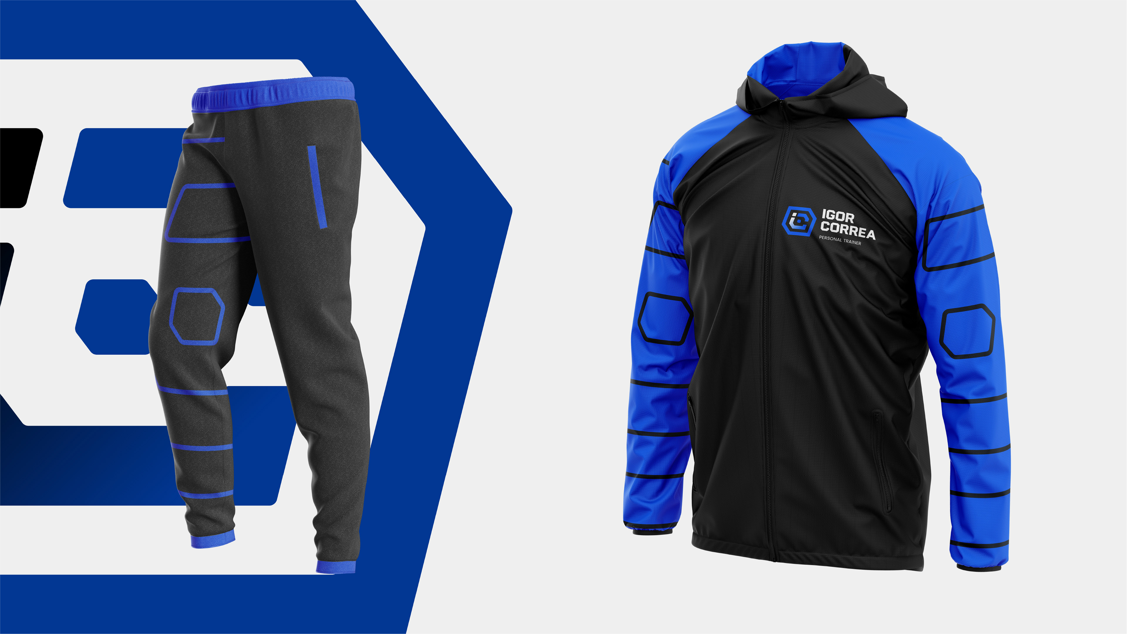
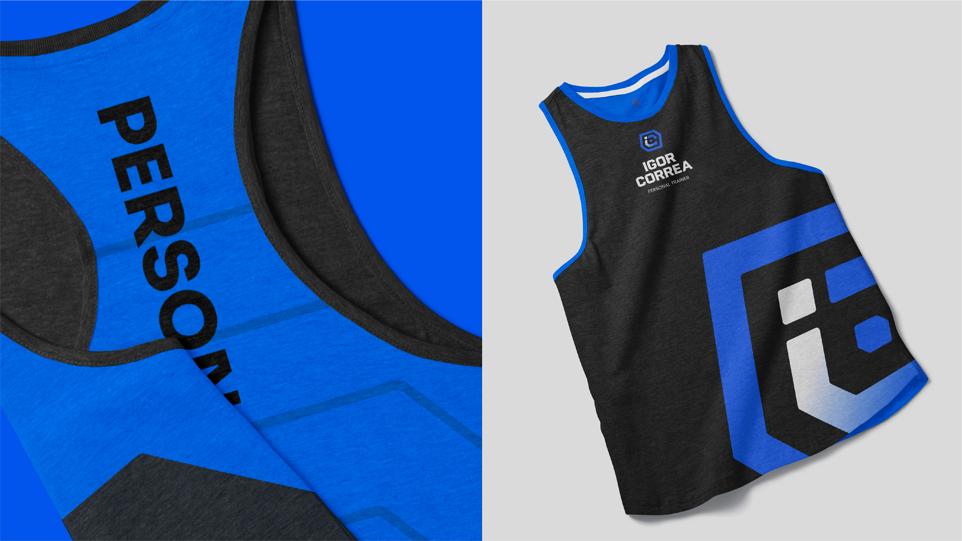
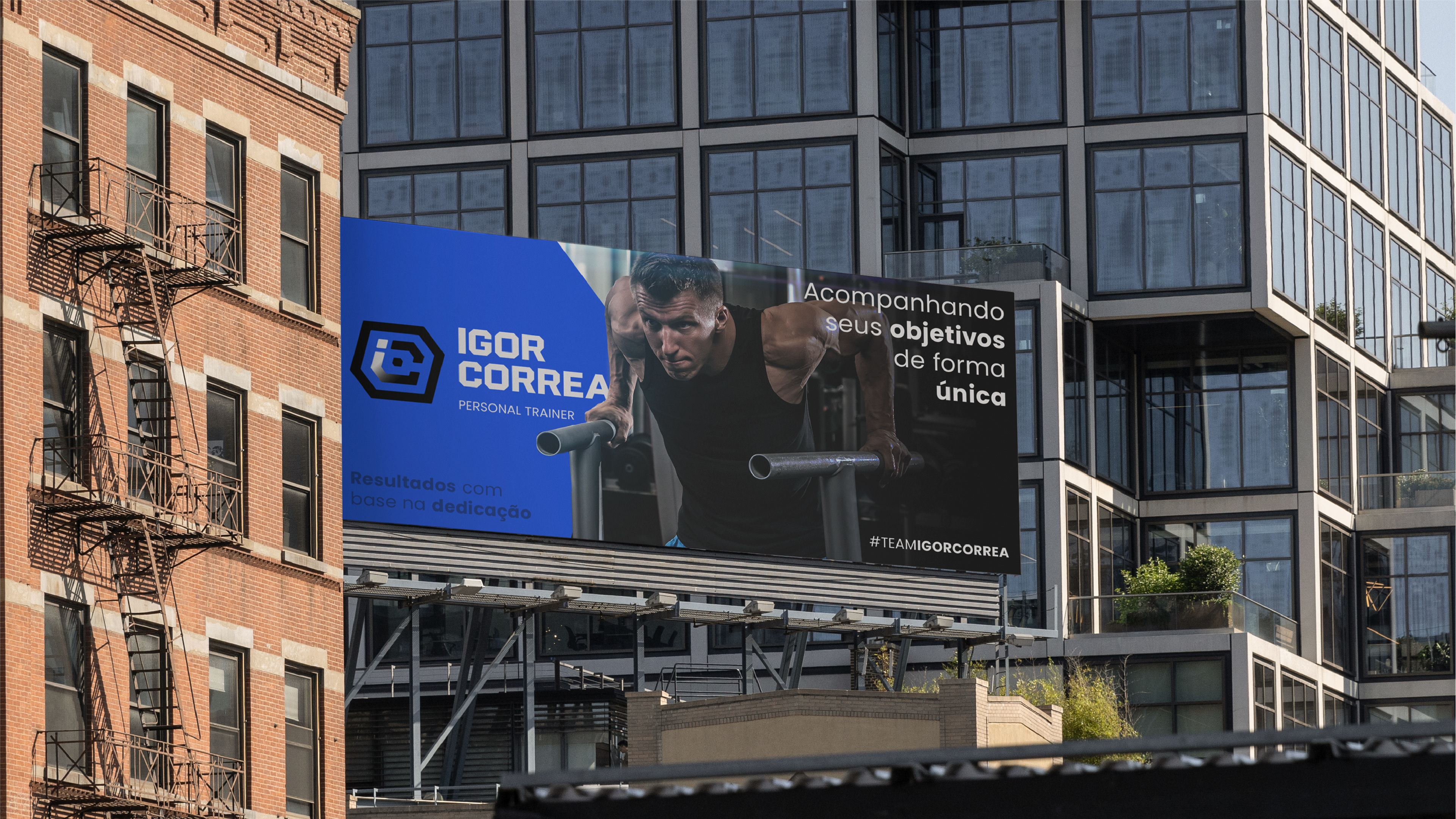
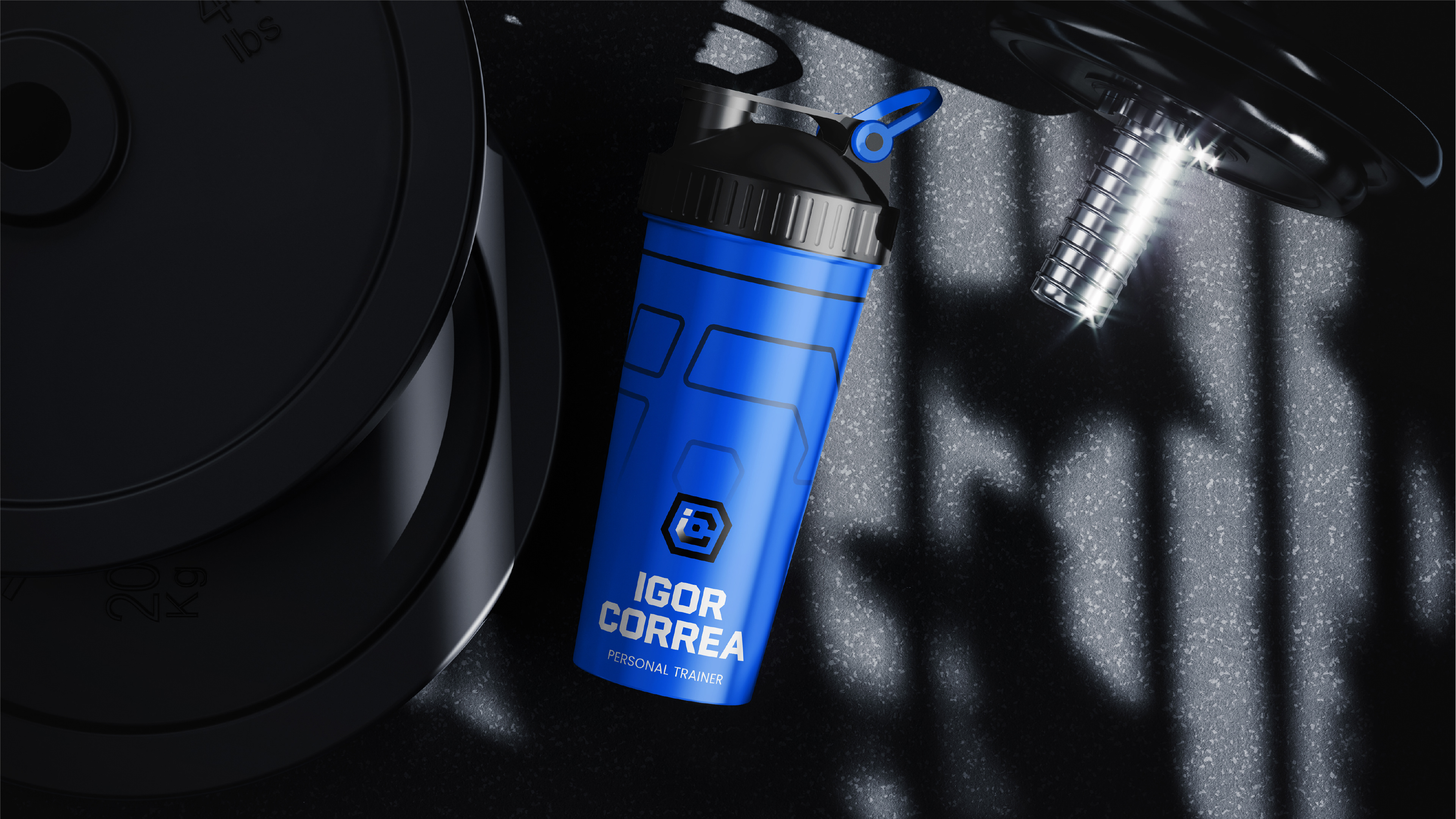
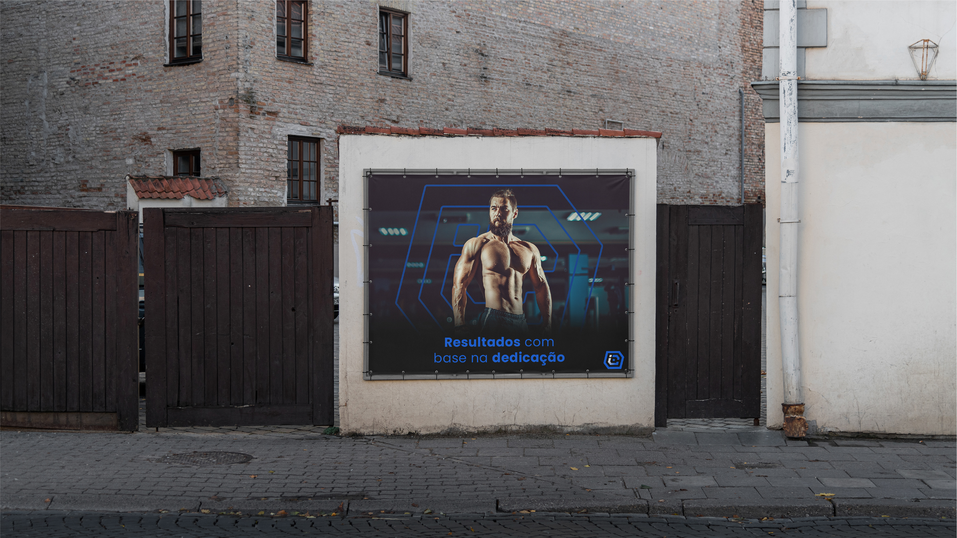
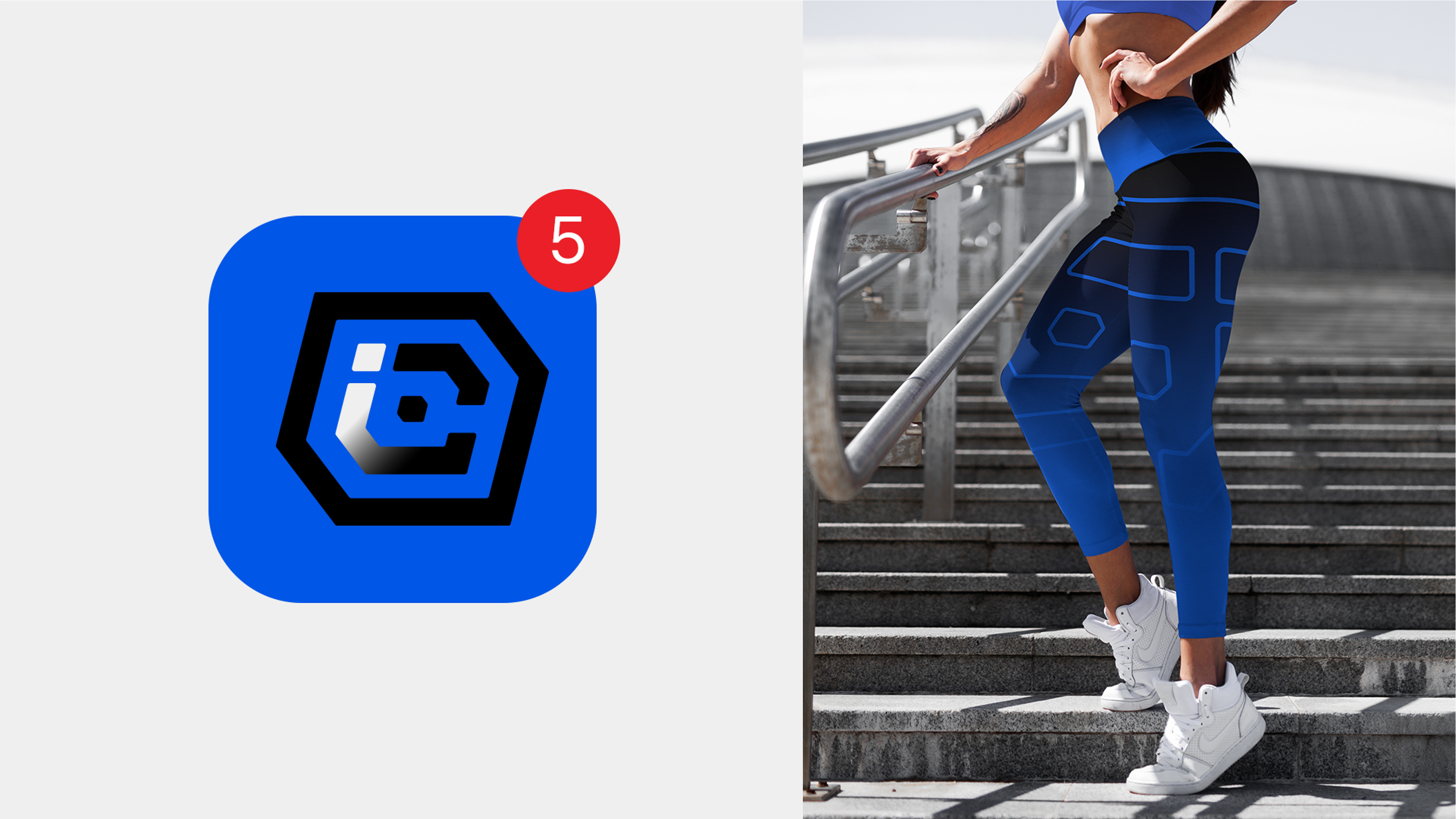
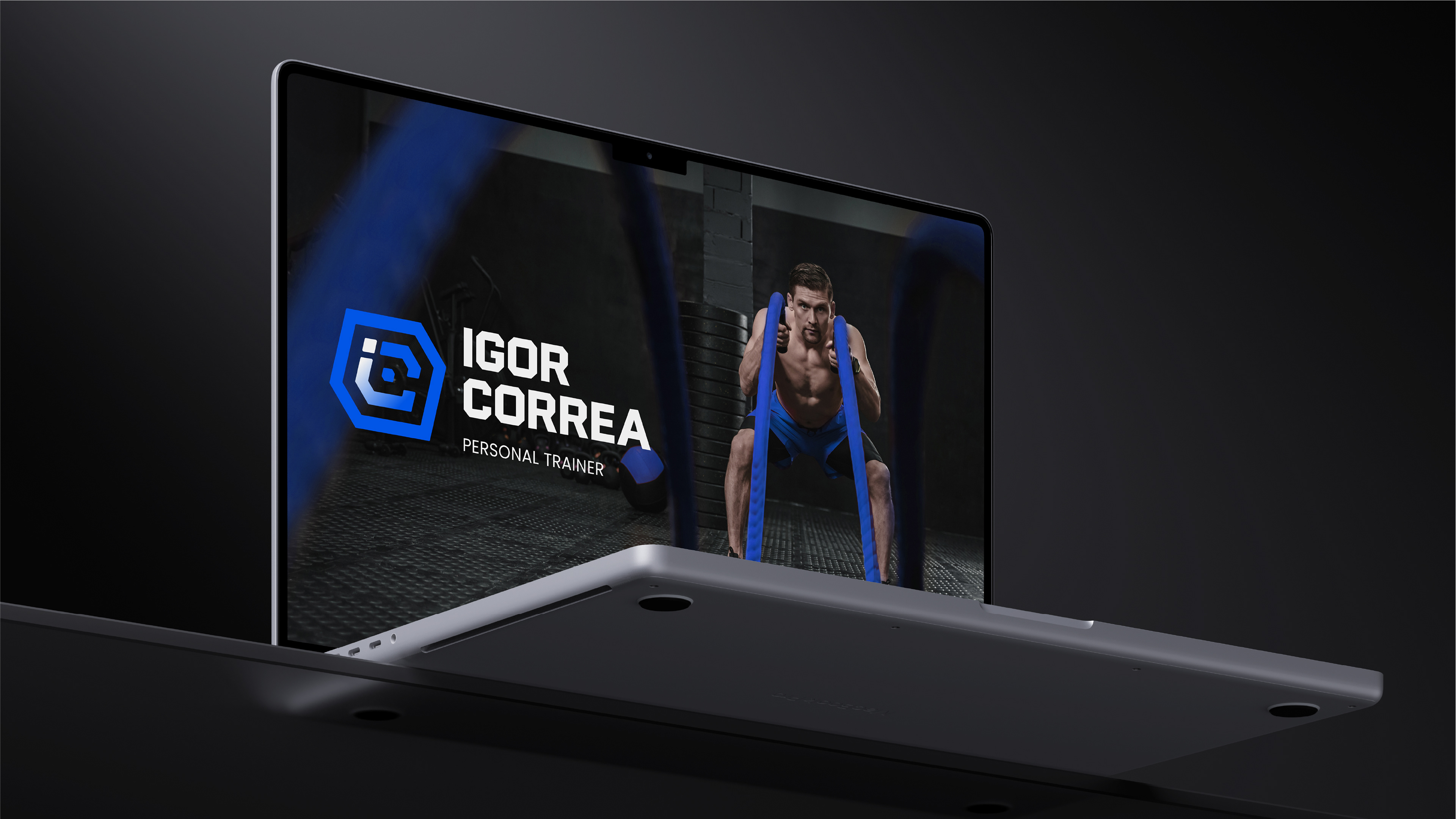
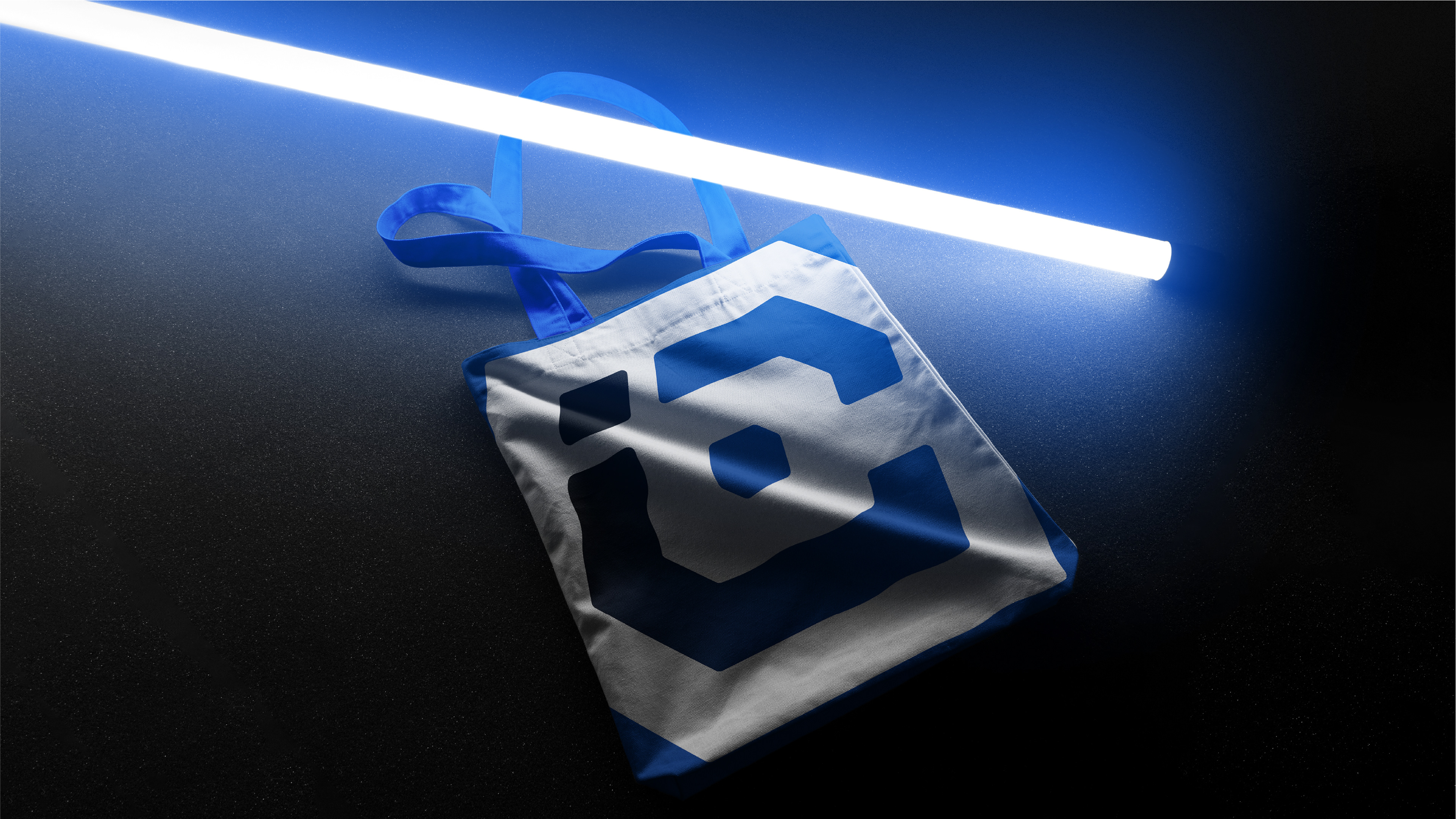
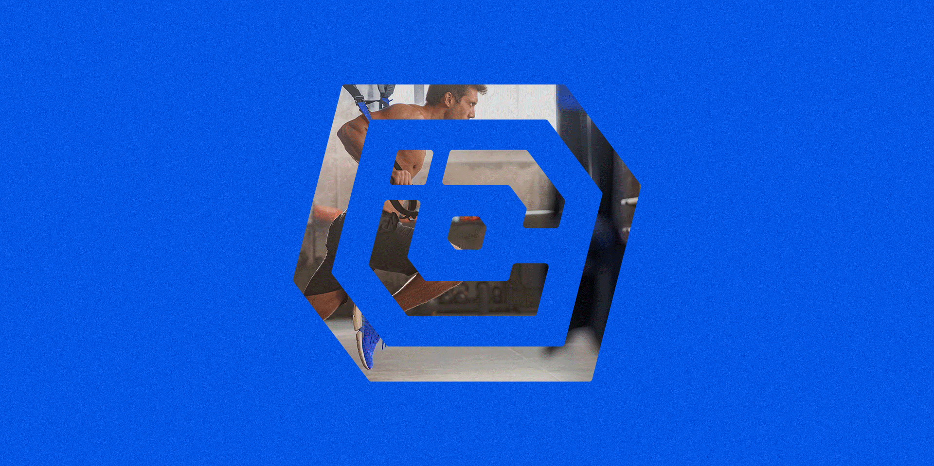
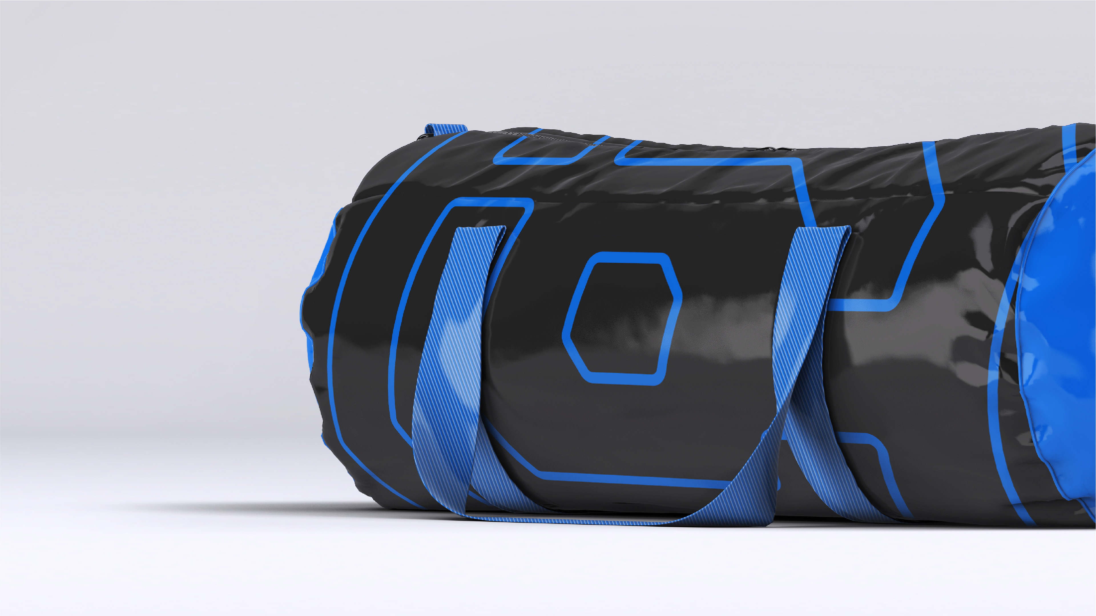
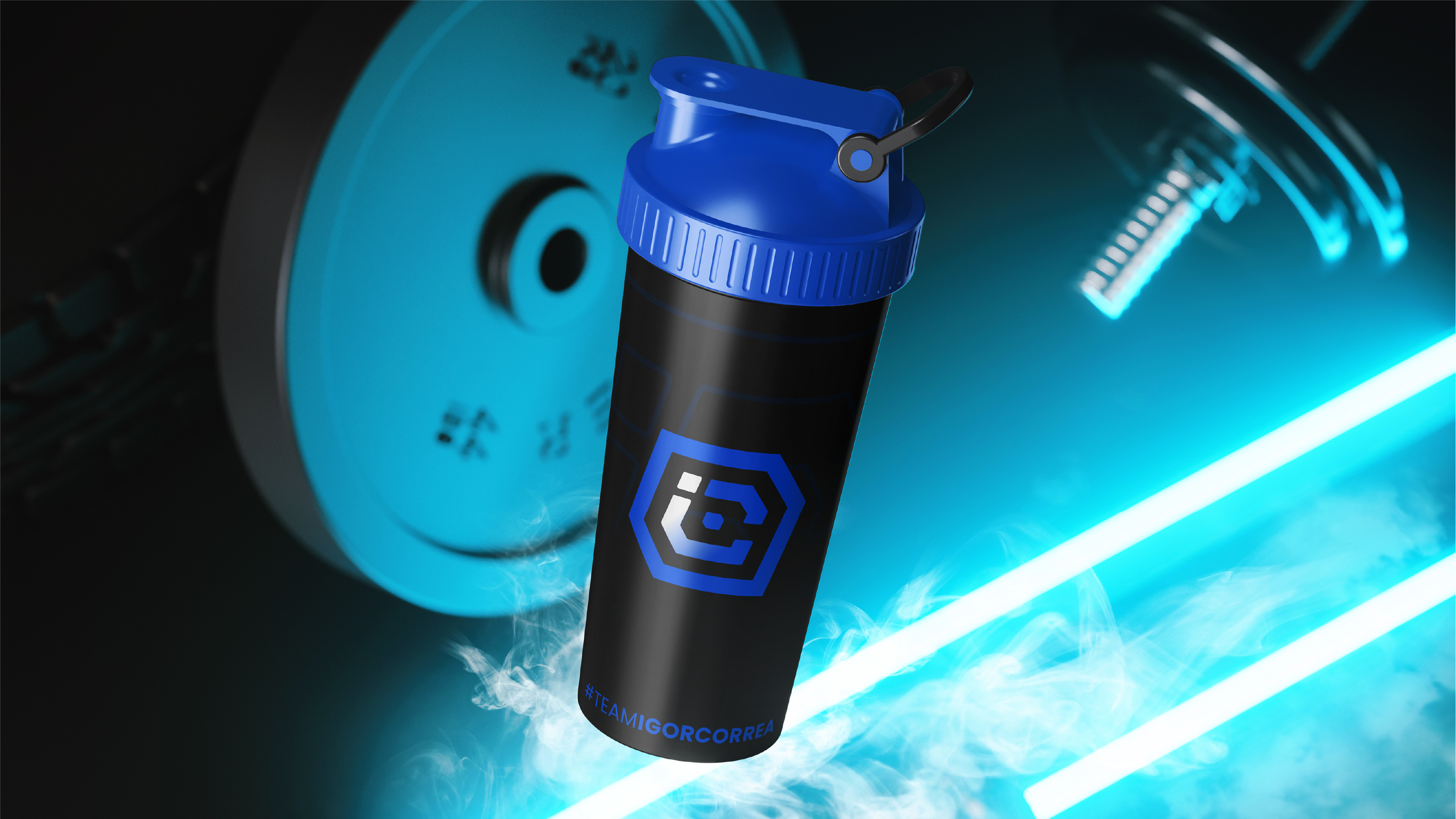
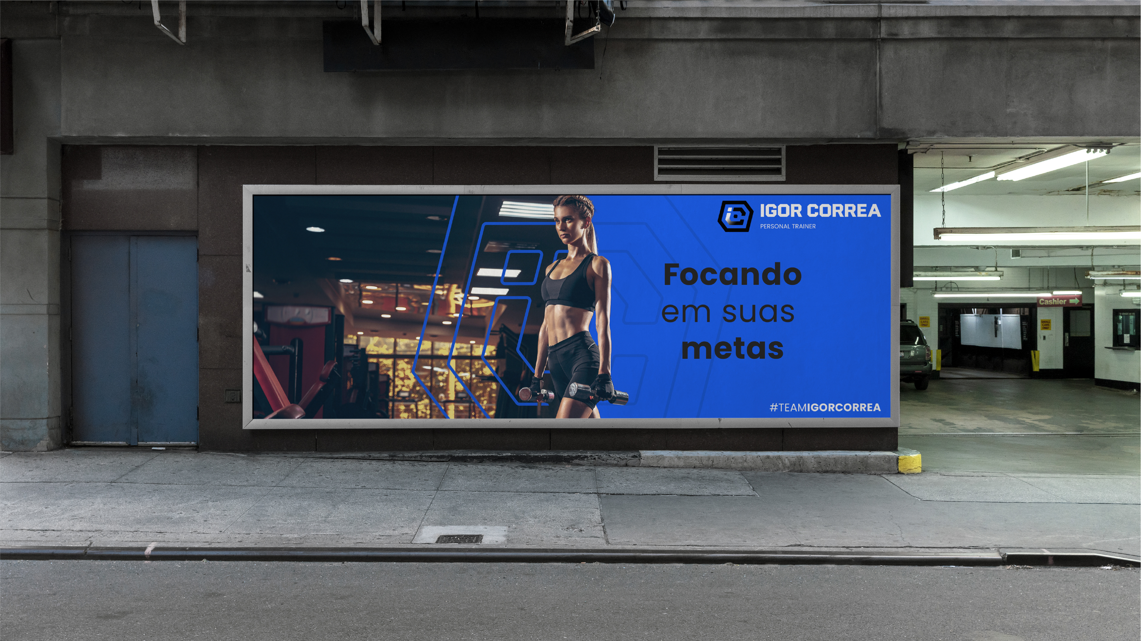
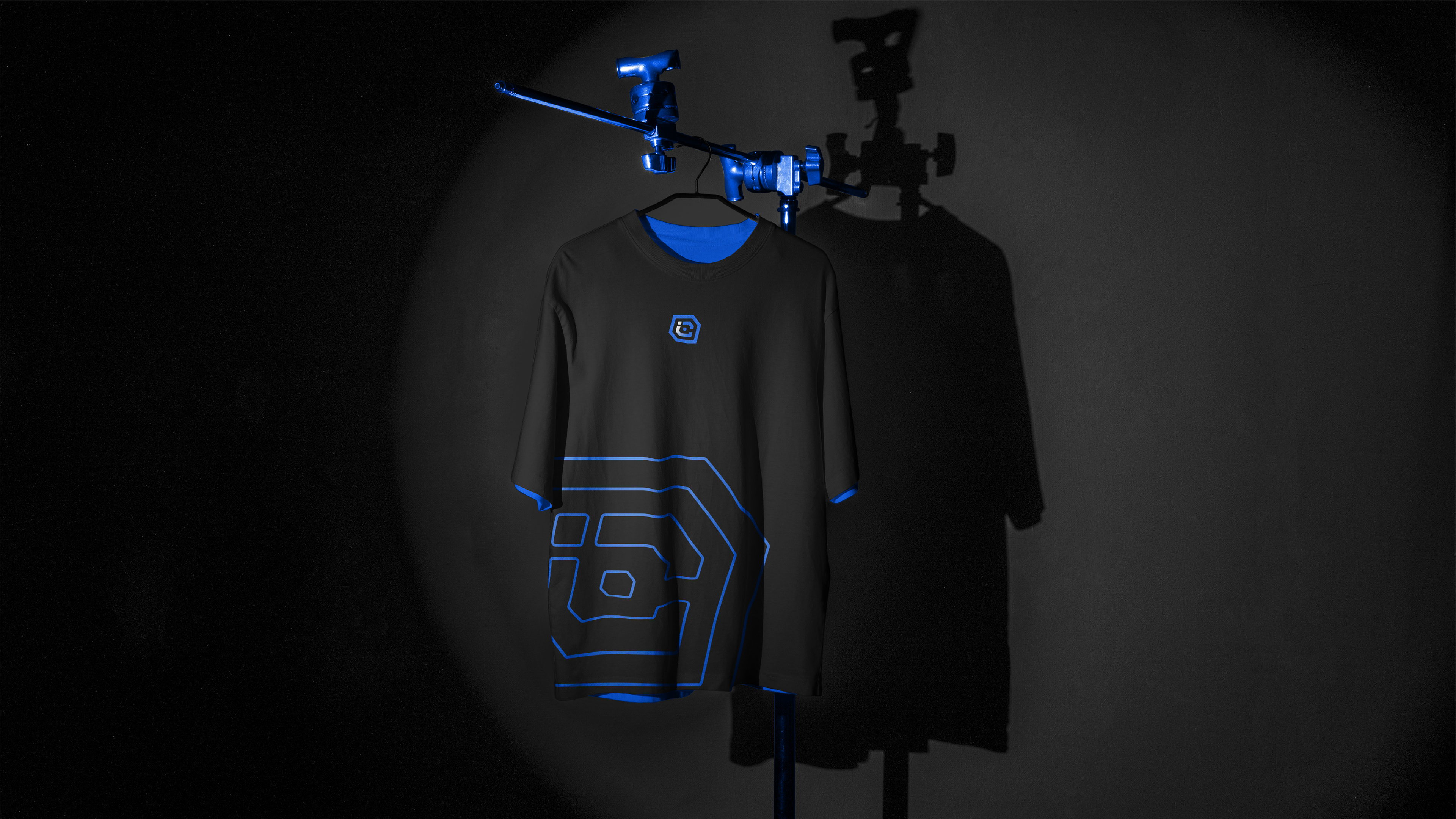
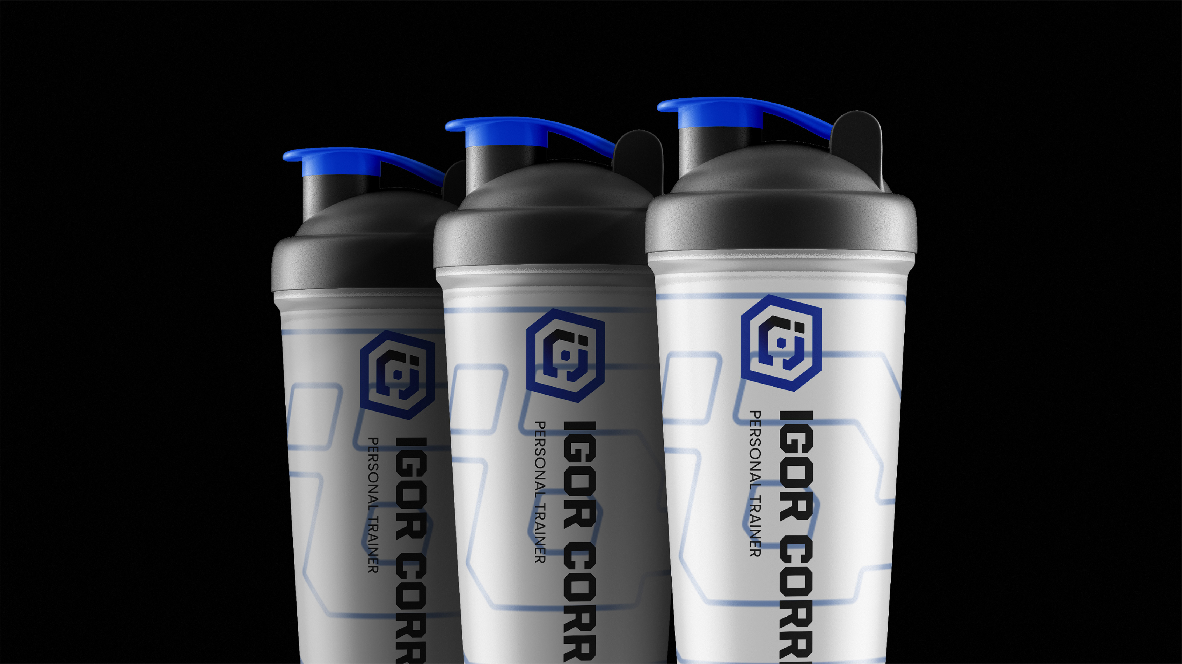
O profissional é forte, dedicado e possui uma abordagem personalizada e única para cada um de seus alunos. O objetivo era representar os aspectos da força e carisma do profissional dentro de uma marca memorável no mercado. O símbolo norteia o projeto, este representa as iniciais I e C do profissional em conjunto, e estas, formando a representação de anilhas em uma barra. Para as fontes trabalhamos um perfil linear forte e marcante e para as cores tons vivos e convidativos.
EN-EU
The professional is strong, dedicated and has a personalized and unique approach to each of his students. The objective was to represent aspects of the professional's strength and charisma within a memorable brand in the market. The symbol guides the project, it represents the initials I and C of the professional together, and these, forming the representation of washers on a bar. For the fonts we worked a strong and striking linear profile and for the colors bright and inviting tones.